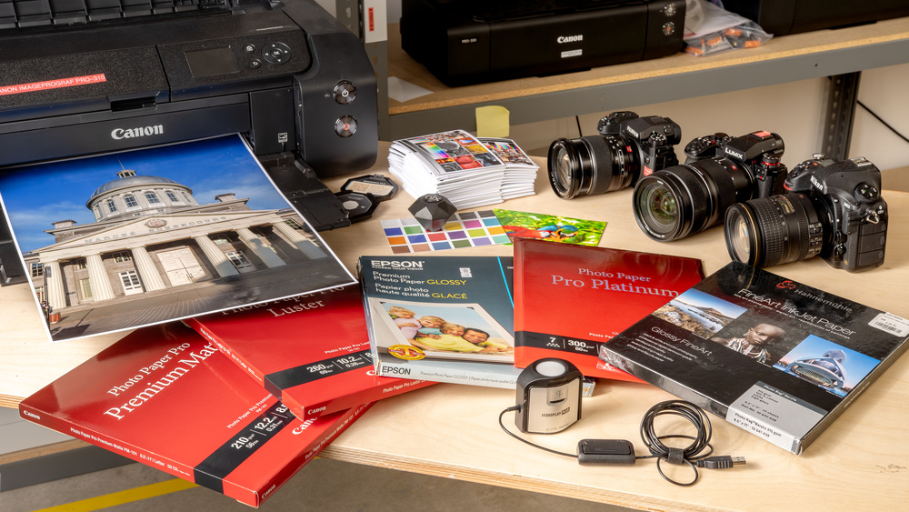
If you take a lot of pictures, you may have tried photo printing at home only to find they don't look nearly as nice as they did on your phone screen or computer monitor. While the photo may look amazing on your device, it's easy for that to get lost in translation when it's sent to your printer. From choosing the right paper to understanding the differences between color profiles, a few key considerations can significantly affect the final print quality of your photo.
Read on to learn more about the importance of color gamut, substrates, and ICC profiles to help you achieve more professional-looking photo printing at home.
What is Color Gamut?
The term 'color gamut' refers to the range of colors a device, like a TV or printer, can reproduce. Generally speaking, you'd want the color gamut to be as wide as possible, as it'll allow you to print pictures as close as possible to the originals and your intent, especially if your pictures contain bright colors. However, when talking about color gamut in printing, it gets quite complicated, as it isn't just about the printer. Many factors affect the color gamut in printing, such as the printer's ink set and application, the type and quality of the ink, the substrate, the ICC profile used, etc.
CMYK vs CMYK+
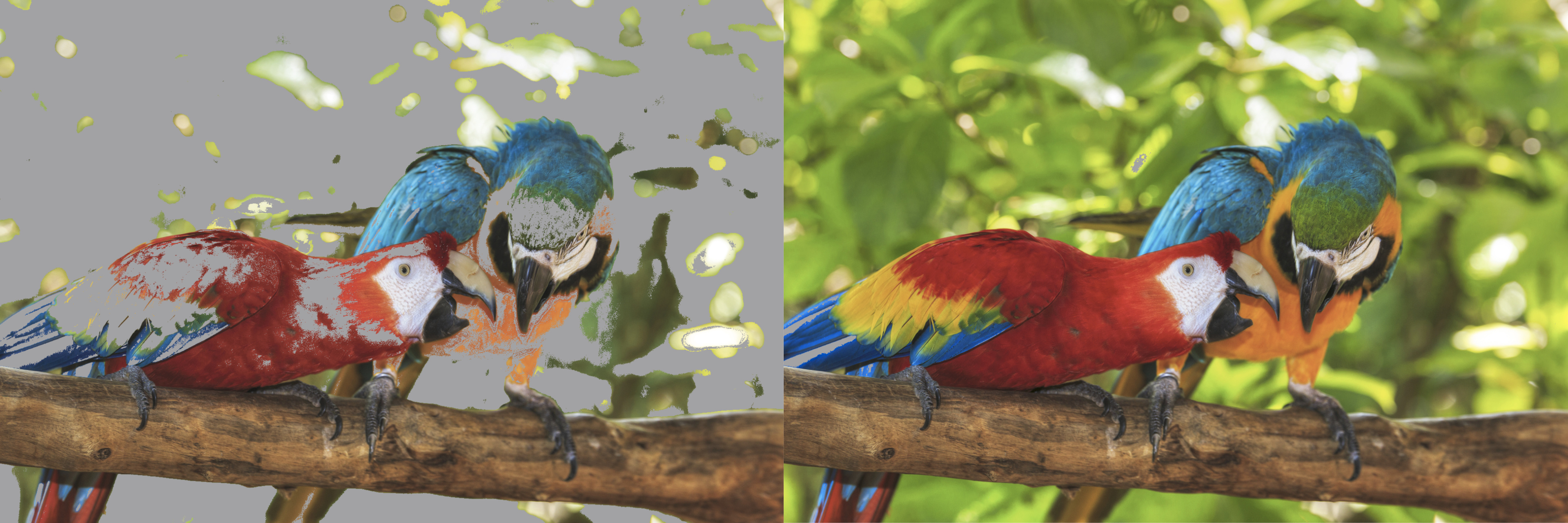
With so many things affecting the color gamut, let's first talk about the printer and ink set. While most general-purpose printers use a CMYK (Cyan, Magenta, Yellow, Black) ink setup, printers designed specifically for photo printing typically have additional inks to expand the color gamut, such as the Canon imagePROGRAF PRO-310. This printer has Gray, Red, Photo Black, Photo Cyan, and Photo Magenta inks, in addition to the standard Cyan, Magenta, Yellow, and Black. Adding more colors to the traditional CMYK setup allows the printer to reproduce more vivid colors and improve accuracy and gradient smoothness. It also means you won't have to spend as much time tweaking your photos to compensate for out-of-gamut colors.
There isn't a specific combination of inks that'll give the best result; every manufacturer uses different combinations. For example, the Epson SureColor P700 uses Light Cyan, Vivid Magenta, Vivid Light Magenta, Light Gray, and Violet ink. This printer adds even more, including Orange and Green.
Using Adobe Photoshop's 'Gamut Warning' function, you can see below how the additional inks expand the color gamut compared to a generic CMYK (ISO Coated) printer.
Pigment vs Dye Ink
There are many types of printers for photo printing; however, inkjet printers are usually preferred, as they typically produce the highest-quality pictures. Of the consumer-level inkjet printers available on the market, most of them use pigment or dye ink, or a combination of both. Choosing the right type of ink for your intent is crucial, so here's a quick list to show which is best for what you're looking for:
| Pigment Ink | Dye Ink | |
|---|---|---|
| Color vibrancy and saturation | ✅ | |
| Detail level | ✅ | |
| Gradient smoothness | ✅ | |
| Gloss differential & Bronzing | ✅ | |
| Longevity (fading) | ✅ | |
| Ink smudging | ✅ | |
| Media compatibility | ✅ | |
| Cost effectiveness | ✅ |
✅ = better
Most of the qualities mentioned in the table are fairly self-explanatory, though we do want to touch on two aspects: gloss differential and bronzing. The former is an unevenness in the reflectance (amount of light reflected) when printing on glossy or semi-glossy paper, meaning areas with more ink reflect light differently than areas with less or no ink. It happens more often with pigment ink because, unlike dye ink, which is absorbed into the paper, pigment particles sit on its surface.
Bronzing is similar; it's when a certain color takes on a metallic sheen. Both phenomena are more noticeable when viewing a picture at an angle. Gloss differential and bronzing can vary depending on the ink and paper, and some modern photo printers even have a dedicated cartridge (Chroma Optimizer in the case of the Canon imagePROGRAF PRO-310) that applies a clear coating on top of the ink to reduce these artifacts.
Substrate
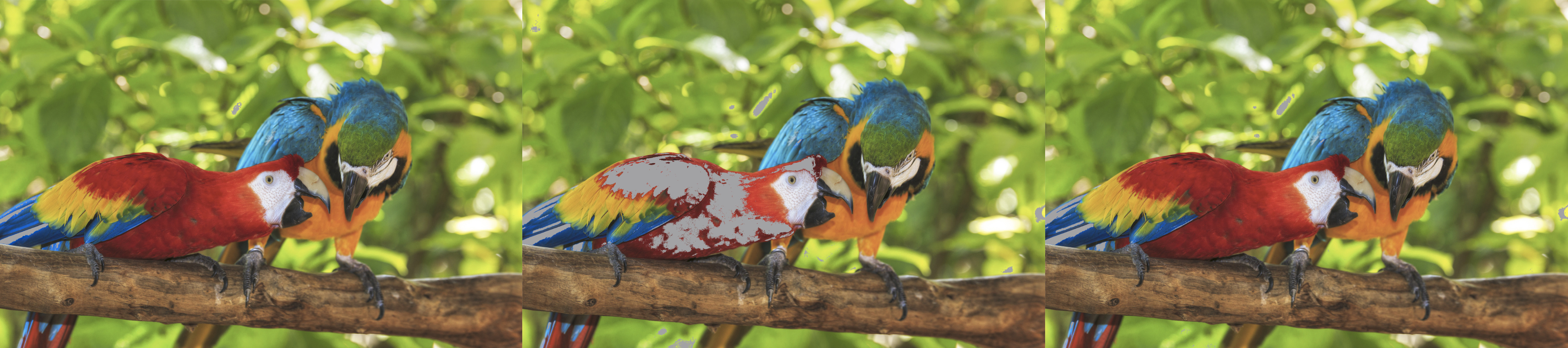
As mentioned above, the substrate you use to print your photos significantly affects the color gamut, and consequently, how your photos will look. In fact, you can produce a wider gamut using a standard CMYK printer and glossy photo paper than a CMYK+ printer with matte paper. Many companies produce photo paper, and each brand has multiple types with different properties, such as its weight, thickness, brightness, opacity, finish (glossy, luster, matte...), and color gamut. In general, glossy paper produces a wider range of colors than luster, matte, or fine art paper; however, its reflectivity might not be suitable if you plan on displaying your photos in a brightly lit room, as the glare will make the picture hard to see and appreciate. Ultimately, the choice of paper depends on your artistic intent and what you plan to do with the photos. Experimentation is key to a beautiful print.
Using Adobe Photoshop's 'Gamut Warning' function, you can see how the color gamut differs between various types of paper.
Display Calibration
It goes without saying that if you want your prints to look as close as possible to what you see on screen when editing (it's nearly impossible to match perfectly), you must first have a monitor with adequate coverage of the color space you intend to use. Full sRGB coverage is fine for most people, but a display with full DCI-P3 or good Adobe RGB coverage is better. A monitor with full Adobe RGB coverage isn't really necessary, as you mostly gain the highly saturated greens, which most printers can't reproduce anyway. You must also ensure that the monitor is well-calibrated.
Calibrating the display can be as simple as generating an ICC profile using a colorimeter, the same way you would calibrate a printer, though combining hardware calibration (using the monitor's physical controls) and an ICC profile typically yields better results. Another option is to look for a monitor with excellent factory calibration, but that's still a temporary solution, as display calibration can drift over time with regular use. If you aren't sure which monitor to get, check out our best monitor for photo editing recommendations.
If printers use CYMK, should I edit my photos in CMYK?
An often-asked question regarding photo editing is, "If printers use CMYK ink, should I edit my photos in CMYK or convert to it before printing?"
The answer to that question is 'no' unless you know exactly why you need to do so. This is because, despite using a CMYK or CMYK+ ink setup, the vast majority of printers are RGB devices designed to receive information in RGB. As for whether you should use sRGB or Adobe RGB, most people can get by with sRGB. However, as you can see in the picture below, CMYK can produce colors that exceed the sRGB color space, particularly in the greens and blues. An example of when you would need Adobe RGB's wider coverage is if you do a lot of landscape photography that contains those vibrant greens and blues.
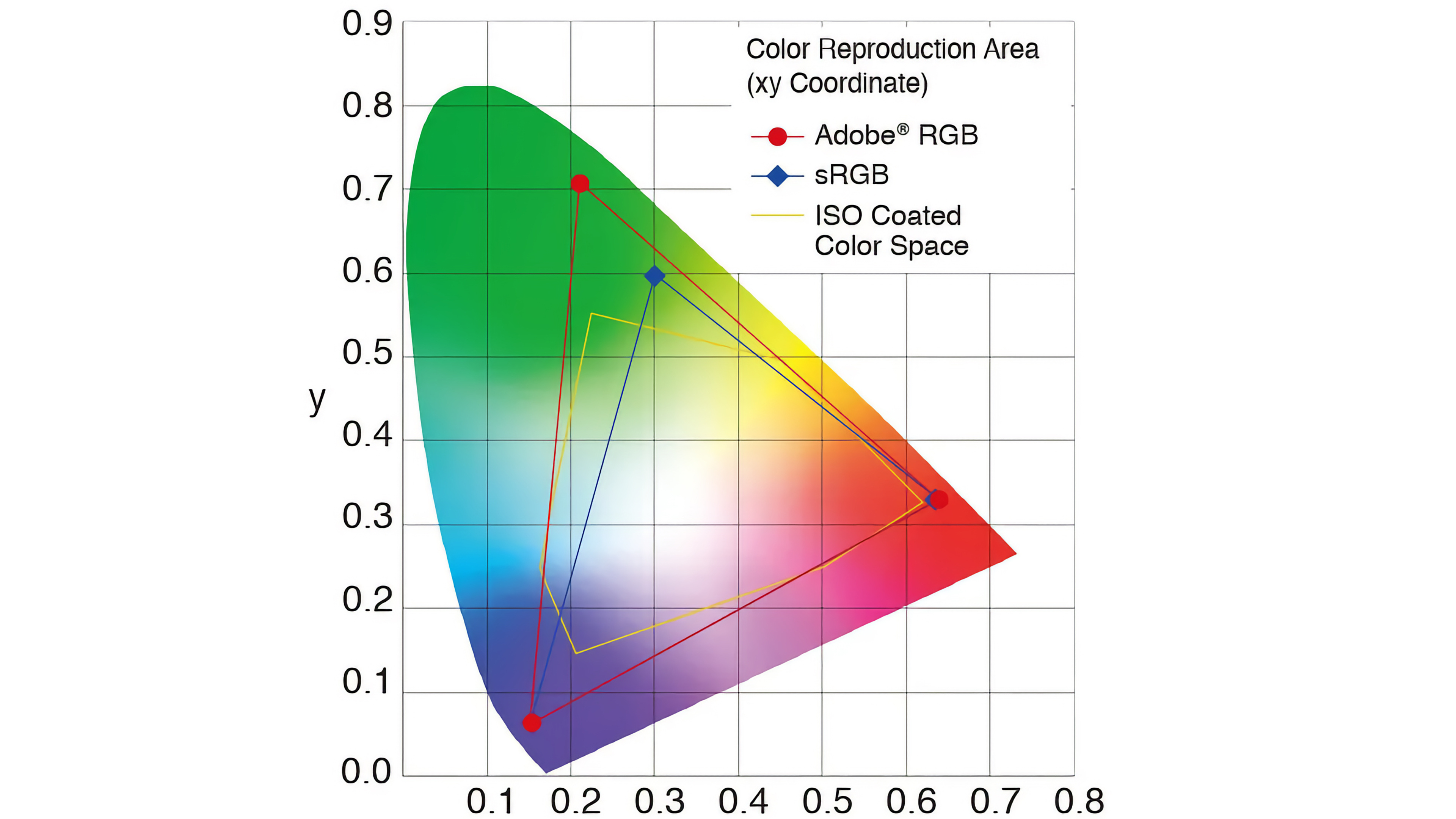
Note: the CMYK coverage shape changes depending on the printer and paper.
ICC Profiles
An ICC (International Color Consortium) profile is a digital file that acts as a translator between devices, instructing the printer how to reproduce each color. All printers come with one or more ICC profiles; basic office printers typically have a generic one that applies to everything, regardless of the substrate, while professional photo printers tend to come with multiple profiles, typically for the brand's own photo paper.
Generic ICC profiles are usually included with the driver; this means that whenever you print something, you're letting the printer decide how to interpret the colors, often resulting in inaccurate colors. The more specific ICC profiles that come with professional printers are better, but they only apply to the brand's own photo paper, so if you want to use paper from another brand, you're out of luck. Also, every printer is slightly different in its color reproduction, even among the same model, meaning the manufacturer's ICC profile can still leave room for improvement.
Like displays, you can calibrate a printer by generating an ICC profile specific to your printer and the paper you intend to use. However, calibration requires proper tools, such as a colorimeter or spectrophotometer. The latter is more accurate but also more costly. These tools generally come with software that lets you create an ICC profile, which you can then use to preview how your picture will look when printed, also known as soft proofing. Having a specific ICC profile for soft proofing will allow you to more easily adjust colors that the printer can't reproduce, thus reducing editing time and ink/paper waste.
Conclusion
Here you go! A quick guide to help you produce better photos. There's so much more to photo printing; we haven't even touched on subjects like black and white photo printing, optical brighteners, rendering intents, RIP (Raster Image Process), and so on. Remember, while this article can offer some guidance in getting better photos, you'll have to experiment a bit to really get results that match your artistic intent. If you would like us to measure the color gamut of printers using various photo paper, let us know in the comments below. You can find more information about how we test printers here, where we give you a quick overview of our review process.