The PQ EOTF is the mathematical function that a TV uses to convert the 1s and 0s of an HDR signal into the brightness level displayed by the TV. We measure how accurately the TV implements this function as part of our TV processing test suite. Good EOTF tracking is important if you care about creative intent, as a TV that tracks the PQ EOTF properly displays an image that's closer to how the content creator intended.
Test Methodology Coverage
Our PQ EOTF test was originally added as a standalone test as part of Test Bench 1.8. Before then, we measured this as part of our HDR Brightness test, but it wasn't scored separately. The scoring curves were changed as part of update 2.0, so while the results are directly comparable across any review, reviews scored on version 2.0 or later can't be compared to reviews scored on anything before 2.0. Learn more about how our test benches and scoring system work.
| 1.8+ (Test results only) | |
|---|---|
| 600 Nit Tracking Delta | ✅ |
| 1,000 Nit Tracking Delta | ✅ |
| 4,000 Nit Tracking Delta | ✅ |
When It Matters
In HDR, the content creator sets the exact brightness of every part of a scene. For example, if there's a lamp in a scene that's supposed to be 250 cd/m² (also called nits), then the TV should display it at 250 cd/m². However, not all TVs do this perfectly, so some scenes might be displayed brighter than they should be, and some may be dimmer than they should be. The PQ EOTF test tells us how accurately a TV implements this function, which in turn shows us one aspect of how well a TV respects the content creator's intent.
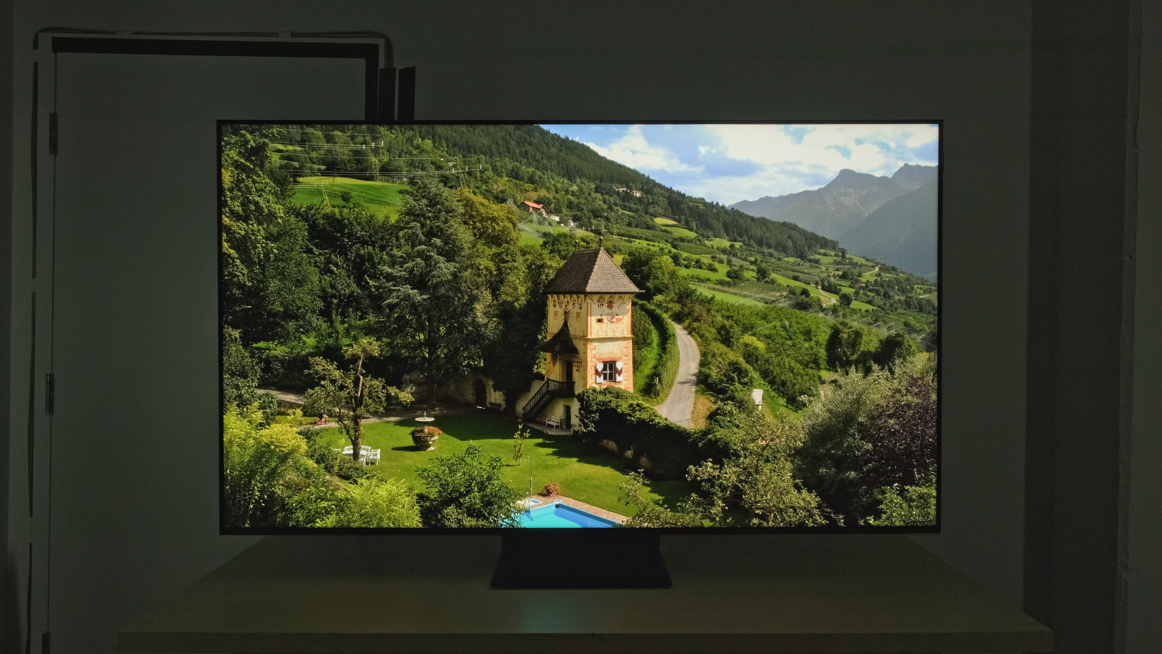 Landscape Pool - 473 cd/m² |
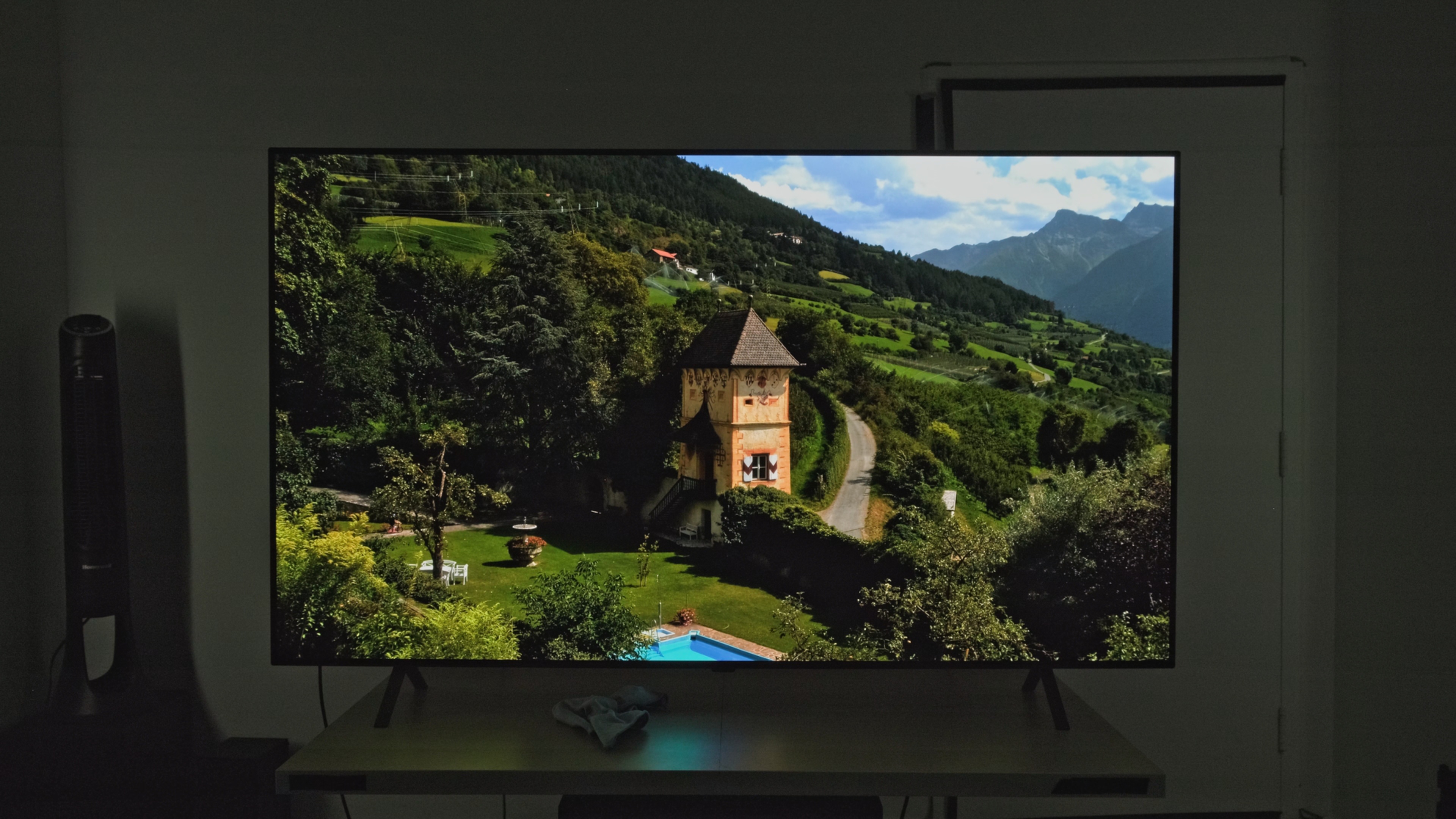 Landscape Pool - 258 cd/m² |
Let's take a look at how this impacts real scene viewing. The Landscape Pool HDR Brightness test is a good indicator of how well a TV's PQ EOTF tracking impacts real content. This specific test has a relatively low peak brightness that the vast majority of TVs on the market in 2026 can reach. If a TV tracks the EOTF properly, it should display the pool along the bottom edge at around 300 cd/m². Here you can very clearly see the difference between a TV that tracks well and one that tracks poorly. The TCL is significantly boosting the entire scene, and it's much brighter than it should be. The LG looks substantially dimmer, but that's how the scene is meant to look.
In the end, accurate PQ EOTF tracking only matters if you actually care about creative intent. Looking at the above two examples, a lot of people may actually prefer the TV on the left. In fact, one of the most common complaints about HDR is that it looks too dim.
Our Tests
Our PQ EOTF tests show how well a TV tracks the content creator's intent when displaying HDR content. To run this test, we first determine which picture mode is the most accurate in HDR, and set the TV in that mode with its accurate settings. For most TVs, this is either the FILMMAKER Mode or 'Movie' preset. Once we've determined the best picture settings, we send a series of images to the TV and measure their brightness. We take a total of 22 measurements, corresponding to stimulus levels between 0 and 100%, with a fixed window size. This test is repeated three times, once with a mastering level set to 600 nits, then again at 1,000 and 4,000 nits.
PQ EOTF Graph
The main output of this test is the PQ EOTF graph. Taking the brightness measurements from the test sweeps, we plot them on a graph that shows how the TV converts the incoming stimulus level into brightness. You can see two example plots below, one from a TV with poor PQ EOTF tracking, and one with fantastic tracking.
This graph gives us a lot of useful information. Let's dive into it and learn how to read it. The bottom axis is the input stimulus, so this is the raw brightness info that we're sending to the TV. The vertical axis is what the TV is outputting, measured in stimulus on the left or luminance on the right. One important thing to keep in mind here is that stimulus is logarithmic, so this isn't a linear increase as you move up the graph. Below, you can see how stimulus levels translate into luminance.
| Stimulus Level | 0% | 5% | 10% | 15% | 20% | 25% | 30% | 35% | 40% | 45% | 50% |
|---|---|---|---|---|---|---|---|---|---|---|---|
| Luminance (nits) | 0.00 | 0.06 | 0.32 | 1.00 | 2.43 | 5.15 | 10.0 | 18.4 | 32.4 | 55.4 | 92.2 |
| Stimulus Level | 55% | 58% | 60% | 65% | 70% | 75% | 80% | 85% | 90% | 95% | 100% |
|---|---|---|---|---|---|---|---|---|---|---|---|
| Luminance (nits) | 151 | 202 | 244 | 390 | 621 | 983 | 1,555 | 2,461 | 3,906 | 6,228 | 10,000 |
Now that we've broken down how to read the graph itself, let's look at how to interpret the results. To begin, we can break the graph down into a few different areas to understand how the TV handles different types of content. A 15% stimulus corresponds to about 1 nit, so looking at the very left side of the graph shows us how well the TV handles extremely dark shadow details. TVs with low contrast and no local dimming, for example, will often have a raised EOTF here. This shows us that those shadow details are brighter than they should be. The total area shaded in yellow corresponds to shadows and midtones between 0 and 200 nits. The vast majority of HDR content falls within that range, so the tracking here is extremely important in understanding how accurate most HDR content will look.
The part of the graph that's shaded in gray shows us how well the TV handles highlight details. This is a pretty vague definition, as technically anything above 200 nits will fall into this area, and that's a pretty wide range. The important part here is to look at how the TV reaches its peak brightness. Very few TVs can actually display up to the full 10,000 nit range, so the TV's processing has to decide how to handle highlight details that are above what it can physically display. Most TVs will cut off sharply at the TV's peak brightness when content is mastered at 600 or 1,000 nits, but they'll use a more gradual roll-off for content mastered at 4,000 nits. This is done to preserve fine details. TVs that don't have this roll-off will often lose fine details in very bright parts of the scene.
600, 1000, And 4000 Nit Tracking Delta
Once we've taken the measurements for the PQ EOTF, the area between the measured curve up to 0.58 stimulus, which is roughly 200 cd/m², and the dotted line is calculated. On the graph, it's denoted by the yellow-shaded area; anything above that (the shaded gray area) is ignored for our scoring. The main reason for this is that the vast majority of content in HDR is mastered in the yellow area, so this is where accurate tracking will have the biggest impact on the overall picture quality. The areas above this are also important, but the difference isn't as noticeable. For example, over-brightened shadow details can be incredibly obvious, but most people wouldn't even notice a 500-nit highlight that's instead displayed at 800 nits; the human eye simply isn't that sensitive to bright lights.
We show the delta for all three lines at 600, 1,000, and 4,000 nits. Each delta is then scored automatically based on the total area. The larger the area, the more the TV deviates from the PQ EOTF. The total score for the box is then calculated based on a weighted average of the three deltas. The 1,000 nit delta carries the most weight, as this represents the vast majority of content currently available.
Conclusion
The PQ EOTF function is a very important factor in the overall accuracy of a display in HDR. Whereas most of our testing has more to do with a panel's raw capabilities, the PQ EOTF is entirely controlled by the TV's software and overall processing capabilities, and it's one area where even high-end TVs sometimes fall short. Understanding how accurately a TV displays HDR brightness levels can be a clear indicator of the quality of the TV's overall HDR experience.