Text clarity is sometimes overlooked when purchasing a monitor since we often focus on how well it performs for gaming or in a bright room. Since essentially all online content has some form of text, it's important for text to be clear and comfortable to read. Aside from resolution and pixel density, text clarity is somewhat subjective, and two people may evaluate the same monitor differently. To minimize this variation, we evaluate text clarity using specific criteria and processes. We judge text clarity under normal viewing conditions, as well as using a close-up photo, and we look at how well it handles subpixel rendering techniques like Windows ClearType.
Test results
When It Matters
Much of what we look at on monitors is text, so text clarity matters most of the time you're using a monitor. Windows has a special rendering system called ClearType to enhance text clarity, but this only works when it directly renders text itself. For example, the text in most web browsers is rendered by Windows, so it can be sharpened through ClearType. However, if you're looking at text that's part of an image, ClearType isn't used, as the picture contains pre-rendered text. Monitors with high text clarity scores display sharp text in either situation.
Our Tests
Since text clarity is a subjective test, we try to minimize the variables involved. We use one computer with Windows 10, followed by another running Windows 11, connected to the monitor being tested. The brightness is set to 100 nits using a checkerboard pattern as our reference, and we leave most settings at their default values, such as sharpness and the native resolution, and we use Windows' default scaling for the given resolution. We use black text on a white background with Windows' dark mode off. Photos are taken with and without ClearType enabled, which are then subjectively scored.
Text Clarity
When scoring for text clarity, we look at several factors. First, we judge the legibility of the text subjectively; the easier it is to read, the higher it scores. Then, we compare it to other monitors of the same size and resolution we've tested and adjust the score accordingly. We also subjectively examine how ClearType affects text clarity, as it doesn't always behave the same depending on the panel type and subpixel layout. Finally, we also consider how a screen's coating affects text clarity. We take photos in both Windows 10 and Windows 11, but text only looks notably different between the two when ClearType is off.
ClearType On
Windows users can access ClearType, which optimizes text to take advantage of the subpixel structure to allow for clearer fonts, especially when displaying diagonals or curved areas. Generally speaking, ClearType does a fairly good job at sharpening text, particularly on lower-resolution displays. Still, it can also make the edges of a letter look more blurry, somewhat like an anti-aliasing effect, a process that softens jagged edges in games.
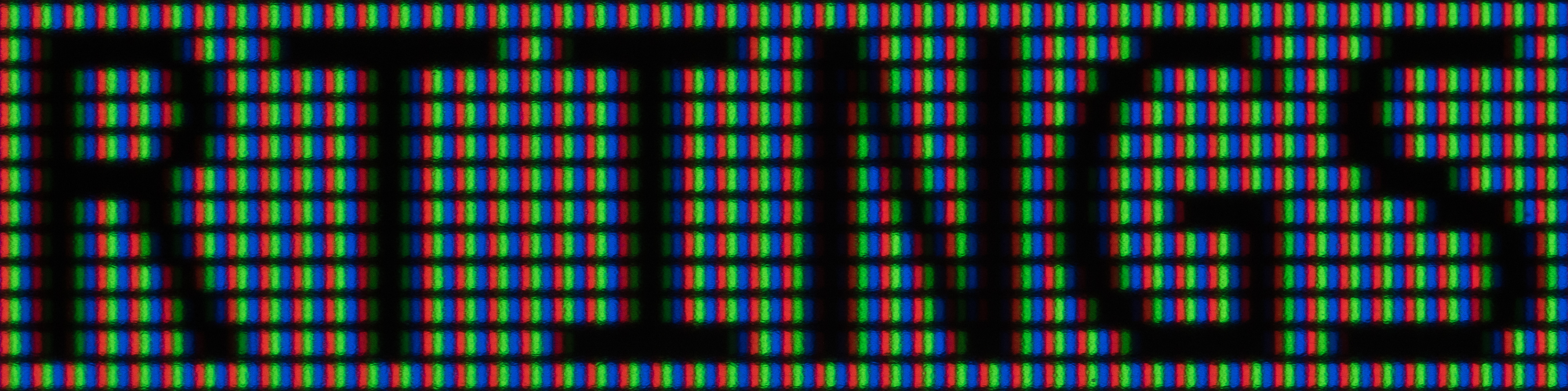
We'll first look at text with a standard RGB subpixel arrangement. In this photo, look at how well-defined the letters are, especially diagonal lines like the ones on the 'R' and 'N' in the photo of the Dell G2724D. We take a photo with ClearType on with Windows 10 for every monitor review and include a link to a photo with ClearType on with Windows 11 as well. When ClearType is on, lettering looks very similar in both Windows 10 and Windows 11.

ClearType Off
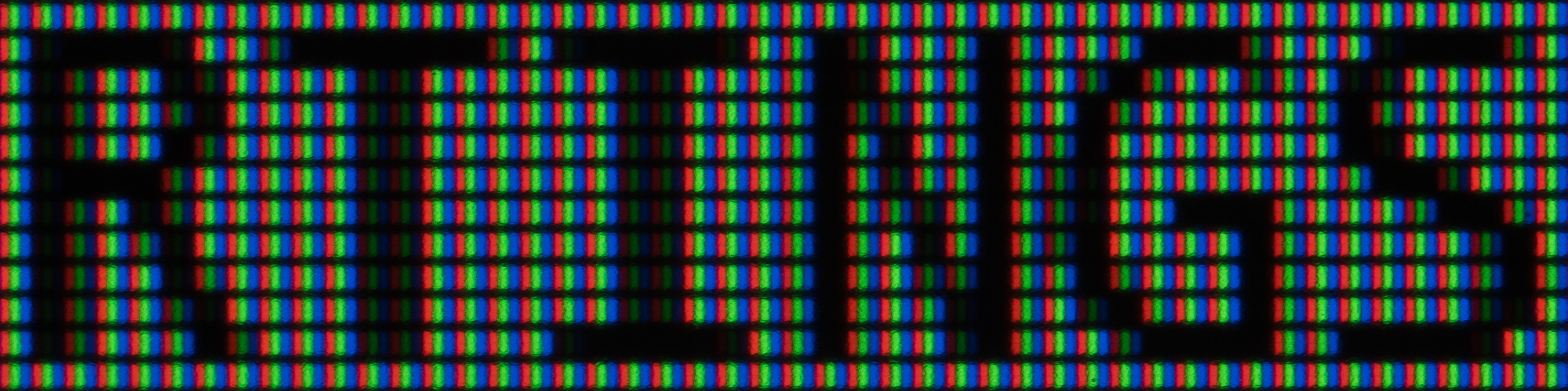
In the photo with ClearType off, look again at how defined the letters are. The diagonal line on the 'R' looks more jagged, and the diagonal line on the 'N' is almost impossible to see. Without subpixel rendering, all three subpixels at the edge of a letter are lit, creating a shadow effect and making letters like 'T' and 'I' look uneven. We take a photo with ClearType off with Windows 10 for every monitor review and include a link to an image with ClearType off with Windows 11. When ClearType is off, lettering looks notably different in Windows 10 compared to Windows 11.

Subpixel Layout
As described above, nearly all IPS, VA, and TN monitors have an RGB subpixel layout. However, some monitors have different subpixel arrangements. WOLEDs have RWBG or RGWB layouts, while QD-OLEDs have a triangular RGB subpixel layout. A few monitors even have a BGR layout. Sometimes, these different layouts don't matter, as they aren't noticeable when displaying an image. However, they can cause issues with text in some cases.
OLEDs
WOLEDs have two distinct subpixel patterns with different subpixel rendering performance. Older RWBG layouts have more fringing, while newer RGWB layouts look bolder and have less fringing. The triangular subpixel layout of QD-OLEDs looks different from both of these. You can see how the three layouts compare to each other below:


BGR
Most non-OLED monitors have an RGB subpixel layout, but a few have a BGR layout. Monitors with this layout, like the Gigabyte M27Q (rev. 1.0), have the red and blue subpixels reversed. This can negatively affect text rendering unless you properly configure ClearType. See the "Enabling and Tuning ClearType" section below for how to help mitigate this with these monitors. You can see how BGR subpixels look below:

Additional Information
Impact of Pixel Density on Text Clarity
The higher a monitor's pixel density is, the less text fringing is visible with OLEDs. Depending on how high the pixel density is, fringing may not even be visible to some people. For example, despite having a triangular subpixel layout, the Samsung Odyssey OLED G8/G80SD S32DG80's text fringing isn't noticeable at all to some people in regular use:

If you want an OLED and are concerned about fringing, look for monitors with high pixel densities.
How To Get The Best Results
Enabling And Tuning ClearType
If you want to use ClearType to improve text clarity, type in 'ClearType' in the Windows search bar and choose the option 'Adjust ClearType text.' On the first test, where there are only two options, although it isn't clearly stated, the left choice is for monitors with an RGB subpixel layout, while the right one is for a BGR layout. You'll then be prompted to go through a multi-step tuning guide where you repeatedly select the box that looks best to you. Features like ClearType are a matter of taste, so you should adjust it to your preference. If you don't get the desired result, you can always perform the tuning again or turn it off. ClearType doesn't work across all programs, so it might not be applied everywhere, even if you tune it properly.
WOLEDs And ClearType
WOLEDs have dedicated white subpixels. As a result, if you turn ClearType off, text will only be rendered using white subpixels, provided you're looking at black text on a white background (or vice versa). This eliminates fringing, but it also decreases the boldness and clarity of letters, as you can see below with the ASUS ROG Swift OLED PG27AQDP when ClearType is off:

If you want to avoid fringing and don't mind text looking less bold, you may prefer this option if you have a WOLED.
Conclusion
Text clarity is important when purchasing a monitor since most of us use a monitor for multiple purposes. Generally, the higher a monitor's pixel density, the sharper text will look, even if you don't use ClearType. However, alternative subpixel layouts can impact clarity. Running the ClearType Text Tuner can enhance the appearance of text, particularly if you have a monitor with an unusual subpixel layout. We evaluate text clarity by setting brightness to 100 nits, leaving most settings on the monitor at their default values, and subjectively scoring how clear the text is.